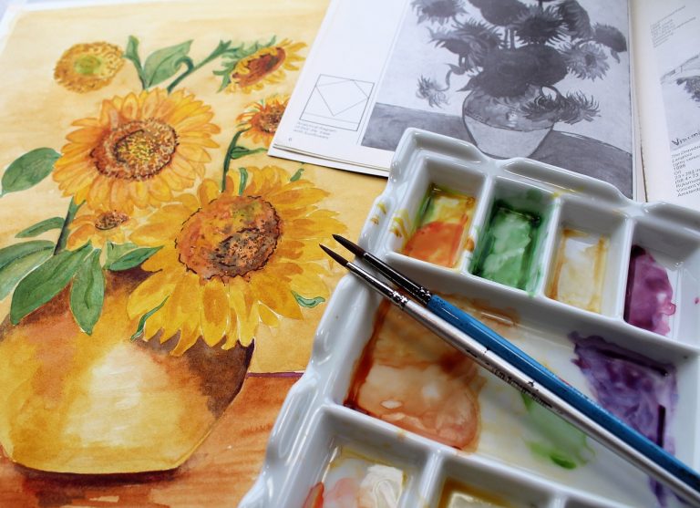
What Is the Definition of Contrast in Art | With 6 Examples!
Along with other abstract ideas like movement, unity, and emphasis, contrast is one of the seven principles of art and design.
Contrast is anything that distinguishes one form from another. This means that every art piece exhibits some form of this artistic principle.
Without contrast, all art would be a singular color, shade, or texture. Contrast is needed to create distinct marks in your artwork.
Areas in your art with more contrast will attract the viewer’s attention. In this way, artists use contrast to draw attention to specific locations on their art piece that the artist may want to emphasize.
Artists can utilize contrast to guide the viewer’s eye across a painting. It can also be used to emphasize one area of the piece that the viewer should concentrate on. In this way, the other principles of art stem from the intentional use of contrast.
Below we list some examples of contrast in art and discuss different forms in which contrast can appear. Utilize these techniques to master using the concept in your work. Every piece of art has some inherent contrast, but learning how to control it can take your artwork from good to great.
Examples of Contrast in Art
As stated previously, it is impossible to create any variance in your artwork without some degree of contrast. Contrast is as simple as placing two unique colors next to each other or using two mediums together in a painting.
But what if those two colors are a bright yellow and a dark blue? What if those two textures are a smooth gradient next to a rough impasto? The larger the difference between the two elements, and the closer their proximity, the more contrast exists in the artwork.
There are an unlimited amount of ways to create contrast in your art. Here are some examples to help you use contrast with intention in your work, regardless of what medium you choose.
1 Light/Dark Contrast
Light and dark contrast, otherwise known as value contrast, is one of the first concepts taught to artists learning the fundamentals. It is likely that you first touched upon this skill while learning to shade in black and white. Controlling value to add contrast in your piece can help you make a scene more realistic, adjust the lighting, or add drama to your art.
The idea of value contrast is further complicated when you add color into the mix. This is because each color has an inherent value. A basic example is a bright yellow sun next to a dark blue sky. Not only are these different colors, which create contrast, but the bright yellow has an inherently lighter value than the dark blue.
Inherent value in color can be pretty tricky to work with as you learn just how complicated working in color can be. Try focusing your light/dark contrast skills by painting in black and white first and then graduating to color once you feel comfortable.
One way to check that you are using light/dark contrast appropriately in a colorful painting is to take a picture of it and convert it to a grayscale image. Once that is done you will get a better idea of the intensity and layout of the contrast in your piece.
2 Color Contrast
In addition to value contrast, two other kinds of contrast occur when you work with color: hue contrast and saturation contrast.
Hue contrast occurs when two different colors are placed near each other in a painting. For example, contrast is created when a bright red is placed next to a bright green. Those colors may have the same value, but their hue contrast separates them in the viewer’s eye.

Saturation contrast occurs when one color is close to a gray or neutral tone, and another color is close to full saturation. Take painting leaves on a tree, for example. The bright leaves illuminated by the sun might be bright green. While the leaves tucked in shadow may be a gray-green.
If you couldn’t tell already, it is often the case that value, hue, and saturation contrast all work together. Adjusting one aspect of color may inadvertently affect the other two as well.
We return to the tree example: the illuminated leaves on your tree painting may be a bright yellow-green, while the shadowed parts may be a dark, de-saturated blue-green. This is how value, hue, and saturation all work together on one object.
Careful mastery of value contrast, as well as both hue and saturation contrast, are the keys to color contrast in a work of art. All of these ideas build on each other, so it is best to be aware of all three. Practice them individually, and then try to gradually work all three ideas into your future works.
3 Shape Contrast
Shape contrast invokes the use of different shapes and forms to create interest in your image. Shape contrast comes into play in the composition of your piece before any value or color is added.
For example, in a beach painting, the rounded tops of sand dunes will contrast the stark wooden stakes marking them off with rope. This would then contrast the long, graceful stalks of dune grass in the breeze.
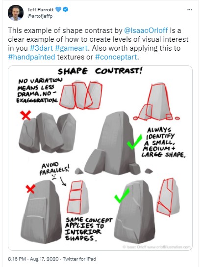
Another example might be adding a cabin in the middle of a rolling landscape. If the majority of your landscape is made of organic shapes, then the rigid and straight lines of the cabin will stand out, drawing the viewer’s eye to that area of the piece.
To practice shape contrast, start by sketching many thumbnails. Break the concept in your head into simple polygons, arranging them in different ways so that the shapes contrast each other. This basic structure will remain once you add value and color to your piece, creating shape contrast in the finished artwork.
4 Texture Contrast
Texture contrast can manifest in two ways. The first is as simple as using different mediums, or varied applications of said mediums, in your artwork to create an actual difference in textures on the piece. You can also paint different textures in your work, using one smooth application but carefully applying color and value contrast to mimic realistic textures.

Tree bark, for example, has a rough texture in life. In art, you can mimic this rough texture by using bold strokes of light and dark values that may also vary in hue and saturation. If you place this textured tree trunk against a smooth background of rolling hills, the tree you created will boldly stand out.
Most painting techniques will allow you to create various physics textures in some way by crafty use of your strokes and mediums. In oils, for example, you can leave a large amount of paint on the page to create rough rocks or thick, frothy sea foam. In watercolors, you can use salt or plastic wrap to texture the medium in different ways.
Creating texture contrast in your work gives you a ton of room to experiment and play with techniques. Who knew that something so fun is also a fundamental aspect of art?
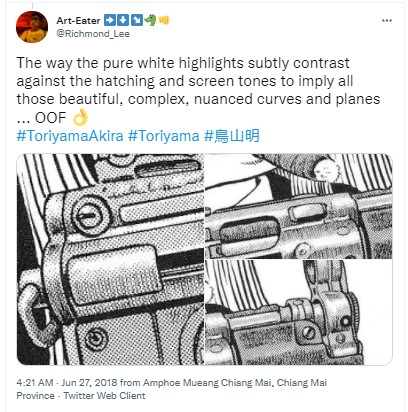
5 Edge Contrast
Edge contrast is the difference between a sharp edge or a blended edge. It is related to shape contrast, as it is a measure of how starkly or smoothly the shapes in your artwork blend together.
The most basic use of edge contrast can be found when establishing a foreground and a background in your painting. Just like when you focus a camera, objects in the foreground become sharp while objects in the background become blurry.
You can use this same idea when creating edge contrast in your work. Place an object with sharp, crisp edges next to a smooth, blended shape to make it stand out. This also works to pull a subject into the foreground of an image.
Edge contrast is usually used to lead a viewer’s eye or balance a piece of work, but it is also used to create different artistic styles. Graphic art styles like cartoons and modern art often use mostly hard edges. If you want a dreamlike, hazy look to your work, focus on using mostly soft edges to give that effect.
6 Detail Contrast
A beginner artist may think that they must add every detail to their work of art to make it realistic. In actuality, this can overwhelm the viewer and create a very uniform, uninteresting piece of art. Just like with value and texture, detail contrast is an important concept to add to your paintings in order to guide the viewer’s eye and create interest.
Both modern cameras and our eyes cannot pick out every single detail in a scene all at once. Cameras will focus on one specific part of the image, and our eyes will travel around it to pick out details in various places. Having some areas with less detail will give the viewer’s eye a place to “rest” while also mimicking how our cameras and our eyes actually take in the world around us.
Like edge contrast, detail contrast is often used to establish a foreground and add depth to an image. Parts of the image in sharp definition will be pushed to the foreground in the mind’s eye. Soft, blurred, non-detailed parts of the image will be regulated to the background.
A general rule of thumb for using detail contrast is to add detail to key features that you want the viewer to focus on. Then, lessen the detail in areas that are not as significant to the work.
Why Is Contrast in Art Important?
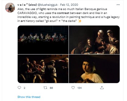
As you can see, there is an inherent level of contrast in every aspect of art. But mastering contrast can take your art to the next level. Next time you go to an art museum, take a look at how the masters like Monet and Van Gogh used all of the different kinds of contrast in their work.
Contrast is vital in art because it makes pieces memorable and intentional. It gives an artist the power to guide the viewer’s eye across the canvas while also granting the artwork the ability to make a lasting impact and linger in the viewer’s mind.
You don’t have to create finished pieces to practice using contrast. Try simple thumbnails and color them in various ways to see how adjusting the color, texture, or edge contrast in each one can affect the entire piece. Collect color swatches and place different colors next to each other to experiment with what colors compliment and contrast each other in interesting ways.
Pieces without much contrast seem repetitive and dull. Thoughtfully applying contrast can make your work powerful and exciting to look at, leaving a lasting impression on anyone who looks at it.