What Are Muted Colors And How To Use Them In Your Art?
Muted colors can sometimes be overlooked in the art world. Art stores and websites often present their brightest, most saturated color palettes for customers to choose from, and those colors can make the litany of dark gray and browns seem less appealing in comparison.
It turns out that muted colors can be the secret to more realistic and interesting work. They can help you alter the mood of your drawings, or they can help you control the viewer’s eye when used in conjunction with saturated hues.
If you only reach for bright colors, try giving muted colors a try. Challenge yourself to paint using only muted tones, and see how it alters the mood of your work. Below we’ve written a guide on how to best utilize muted colors, which will hopefully spark some inspiration for your work with muted colors.
What are muted colors?
There is no strict definition for what makes a color a muted color. Muted colors tend to be any color that could be described as dull, desaturated, or grayish.
Muted colors can be multiple different values and hues as they are not limited to shades of gray or dark colors. Your muted colors can be warm or cool grays, but they can also be a very light brown, a dull purple, or a dark slate blue. Think of muted colors as any colors that can appear in dull or dark lighting.
Most brown tones can also be considered muted colors. A few of these colors are great additions to any color palette in any medium.
Why use muted colors in your artwork?
Muted colors are an excellent way to create contrast in your work, which is one of the foundational skills of art. Placing muted colors alongside vivid colors creates saturation contrast. Using these combinations thoughtfully will help transform your work and accentuate the areas of the piece that you would really like to stand out.
If you only use the brightest, most saturated colors in your work, the viewer’s eye will have nowhere to rest. However, if you place a saturated color in the middle of a muted background, that color will immediately draw the viewer’s eye and become the focal point of the painting. It might seem strange, but muted colors can actually help your artwork look more vivid by using this technique!
Muted colors can also help control the mood in your painting. Using bright blues and purples might create a cool-toned piece, but if you want the painting to feel thoughtful or somber, you might want to try muting the purples and blues. Muted colors can help convey the coldness of a dreary day, the darkness in the corners of a house, or the deep and quiet depths of a forest.
Vivid colors vs. muted colors. I never should've doubted myself being a muted colors type 😌. It's clearly the superior palette pic.twitter.com/ZBkjfvRs6t
— Franklyn’s in Zenji’s Room (@franklynforeal) February 18, 2021
How do you make muted colors?
Muted colors are sometimes created accidentally. You may find that mixing your very saturated colors together creates a muted, muddy result. Mixing too many pigments together will create this muted color, as well as mixing a saturated color with its complement (for example: mixing yellow with purple).
An easier way to create muted colors is to pick the hue or shade that you would like to make more muted and mix it with either black, gray, or white. This will desaturate your chosen color but allow it to keep its hue. For example, if you have a saturated green, you can make a light muted green by mixing your color with a white or light gray.
Brown tones, like burnt sienna and raw umber, also work to mute the colors you are working with. Note that, unlike gray tones, brown tones may affect the hue of your final muted color.
What are the essential colors in a muted color palette?
Muted color palettes can have the same range of hues as a regular color palette. Just like in an ordinary beginner palette, be sure to have a range of hues from red to yellow to blue. Also, be sure to have a good variety of warm and cool colors, as muted colors can be warm and cool just like vivid colors can.
The most essential colors in any muted color palette, however, are a great range of gray values. You can then use these gray values to mix into your saturated colors, giving you muted versions of those colors. Having a range of gray values also means you can control how light or dark the resulting muted color is.
Black and white are also essential members of the muted color palette. These can help your muted colors have contrast. Too many dull and gray hues may make your painting difficult to distinguish, as it will lose value contrast. Adding black or white to any mix will instantly help you lighten or darken it, as well as making it more muted.
Browns are an exciting addition to a muted palette. As stated previously, using browns to create muted colors may alter the hue of the resulting muted color. But a wide range of browns can be interesting to play with, especially if you enjoy painting landscapes, wildlife, or other natural scenery.
Some specific colors that you may want to include in your muted color palette are lamp black, Mars black, zinc white, titanium white, neutral tint, Payne’s gray, burnt umber, raw umber, burnt sienna, yellow ochre, and buff titanium.
How do you successfully use muted colors in your artworks?
Painting from a still-life is a great start to using muted colors in your work. Computer screens or edited photographs may often enhance the saturation of your reference image, which may mean that there are fewer muted colors present than normal. Painting from life will help you avoid this issue and get a realistic view of muted colors.
Find many objects with muted hues and collect them together in order to set up a muted scene to paint from. You can also adjust the lighting of your scene – dimming the lights will create more muted colors for you to paint.
In a similar vein, painting landscapes is a great way to learn how to create contrast in interest with your muted colors. Landscapes are full of browns, gray, and whites, and on an overcast day, they can be particularly desaturated and muted. Grab a Plein air setup on a cloudy day and explore the muted colors in the landscapes around you.
James Abbott McNeill Whistler, Whistler's Mother, 1871
— Max Cole Art (@MaxColeArt) June 2, 2018
A muted limited palette immediately conveys the demure feeling of this fine work. I marvel at the sheer organdy and lace against the black dress!#HistoryofPainting #Artwork #Painting #artists #artistsontwitter #colors pic.twitter.com/tkE3hYMPcL
Just like many other artistic skills, studying the masters is a great way to learn how to become a pro at using muted colors in your artwork. Artists like John Singer Sargent and Edgar Degas have many pieces using only muted colors. Other examples of artists who do great work with muted colors are David Davies, George Henry, Giorgio Morandi, and Childe Hassam.
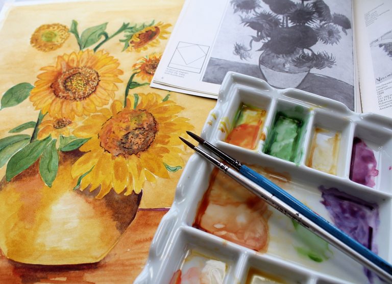
Many artists use a practice technique called a “master study” to learn how to work with new types of painting skills. This involves painting a direct copy of the work of a master in order to practice the techniques that they used in that painting. Finding an art book or searching online may help find paintings that spark inspiration for your future work in a muted color palette.
Using muted colors is like mastering the art of subtly. Too much, and your painting will be dull; too few, and your painting might look garish and bright. You may need to paint many works with muted colors in order to figure out the ideal balance of muted and saturated values in your artwork.
It may take a while to master this new palette, but the end result will make for a more captivating piece of art. Practicing with muted colors often will help you find balance in your work, making your muted colors just as useful as your brightest colors.